Summary:
Creative color combinations can transform your wedding from traditional to uniquely personal. This refreshed guide shares bold, modern, and unexpected pairings you can use to build a memorable theme. You can anchor your palette with linens such as polyester tablecloths to keep your base clean and cohesive while you experiment with complementary shades.
Our Products


Charger Plates
Tablecloths
All Artificial Flowers
Why Eccentric Color Palettes Work
Eccentric color combinations give couples the freedom to express their style. These palettes often blend bold accents with muted bases to create balance. When designed properly, an unconventional palette still feels coordinated and polished. Using stable neutral linens helps ground the look while allowing vibrant tones to stand out without overwhelming the venue.
1. Rich Jewel Tones With Soft Neutrals
Jewel tones like emerald, sapphire, and amethyst create a deep and dramatic look when paired with soft beige or ivory. The contrast between rich hues and light neutrals makes the colors appear more vivid.
Adding draped accents or frames using arch backdrop props helps highlight these tones throughout your backdrop and ceremony area. The combination works especially well for evening weddings and ballroom venues.
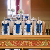
2. Mustard Yellow With Slate Gray
Mustard yellow adds warmth, while slate gray keeps the palette grounded. This pairing is ideal for modern industrial weddings or daytime celebrations.
Using table runners in a complementary shade helps tie the colors together without overpowering the table setting. The blend feels fresh and contemporary, especially with minimalist centerpieces.
3. Terracotta With Dusty Blue
Terracotta brings earthiness, while dusty blue introduces a cool, calming contrast. When used together, they create a relaxed yet stylish wedding palette. Florals or décor pieces in these shades can sit naturally against neutral backdrops.
Incorporating subtle floral accents through artificial flowers helps reinforce the color pairing without requiring seasonal blooms. This combination works well for outdoor or rustic venues.
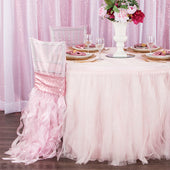
4. Black With Mauve and Taupe
This palette mixes bold contrast with soft undertones. Black provides structure while mauve and taupe soften the look. It works well in chic urban venues. A neat table foundation, such as rectangular tablecloths, helps balance the darker tones and keeps the table design clean. This pairing feels elegant without leaning into traditional wedding color schemes.
How to Use Bold Colors Without Overwhelming Your Design


When using eccentric colors, apply stronger tones in smaller accents and keep larger surfaces neutral. This approach allows your statement colors to shine while maintaining visual harmony.
Lean on linens, runners, napkins, and floral details to introduce color gradually. Repeating the same accent shades across tables helps unify the look so the palette feels intentional rather than scattered.
Lighting and Venue Considerations
Lighting greatly affects how colors appear in photos and in person. Warm lighting makes bold tones feel deeper, while cool lighting can brighten them. Venues with large windows may cause lighter tones to appear softer. Before finalizing your palette, test sample linens and décor under the venue’s lighting to make sure the colors stay true.
Frequently Asked Questions
Should I use bold colors for both the ceremony and reception?
You can, but you do not need to use bold colors everywhere. Many couples introduce strong colors in the reception while keeping the ceremony space softer. This creates visual variety without losing cohesion between spaces.
How do I avoid clashing colors when choosing an eccentric palette?
Start with one main color, one supporting color, and one neutral. Using too many bold tones can cause the design to feel crowded. Creating a simple palette structure helps keep the theme clear and intentional.
Can I mix pastels with dark colors?
Yes, pastels and dark colors work well together when balanced correctly. Use the darker tone for structure and the pastel for softening edges. Testing a few combinations beforehand ensures the tones complement each other.
What is the easiest way to introduce bold colors?
Use small accents such as napkins, runners, signage, or florals. These elements allow you to experiment without committing to large surfaces. As long as the colors appear consistently, the design stays cohesive.
How many colors should an eccentric wedding palette have?
Most couples use two to four colors, depending on the theme. Using too many tones can overwhelm the design, while a limited palette keeps the look clean. Choosing a neutral shade as your base ensures your accent colors stand out.