Summary
Floral centerpieces are often the focal point of a table, but the linen color you choose can either highlight them or make them disappear. The right combination creates contrast, balance, and clarity, while the wrong one can make everything feel flat or overwhelming. Understanding how linen color works with florals helps you create tables that feel intentional and visually cohesive.
Our Products


All Artificial Flowers
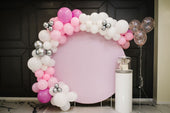
Centerpieces
Table Runners
Quick Answer
- Start with the floral palette, not the linen.
- Use neutral linens to let florals stand out.
- Use darker linens to highlight lighter flowers.
- Match undertones instead of exact shades.
- Choose matte vs sheen fabrics carefully.
A well-chosen linen color frames your centerpiece instead of blending into it.
Start with the Floral Palette First
The most common mistake in table styling is choosing linens before finalizing the flowers. In real event setups, this often leads to mismatched tones or last-minute compromises. Your floral palette should always guide the linen decision, not the other way around.
For example, soft arrangements like blush roses, ivory peonies, and dusty blue accents behave very differently on various linens. Place them on a blush tablecloth, and everything starts to blend. Put the same arrangement on a charcoal or navy linen, and suddenly every petal becomes more defined. The same principle applies to bold palettes like burgundy, red, and deep purple, which tend to stand out better on lighter bases like champagne or ivory.
Think of Linens as the Background
Linen color works best when it’s treated as the background for your centerpiece. It sets the stage for everything else on the table, so it should support the florals rather than compete with them. A clean base makes it easier for the arrangement to draw attention naturally.
For example, a white tablecloth allows bold florals like red roses or mixed seasonal blooms to stand out clearly, while an ivory linen can soften the look of peach or cream arrangements without taking attention away from them. The goal is to create a base that enhances the florals without overpowering them.
Use Contrast to Make Florals Stand Out

Contrast is one of the easiest ways to make a centerpiece pop. Darker linens create a strong visual base that helps lighter florals stand out more clearly. This works especially well in formal or evening setups where depth and definition are important.
A navy tablecloth paired with blush peonies or white roses creates a clear focal point without feeling too harsh. The darker base anchors the table, while the lighter florals draw the eye upward. This kind of pairing feels intentional and balanced, rather than forced.
That said, contrast doesn’t have to be extreme. Even a charcoal linen with soft cream florals can create enough separation to keep the centerpiece visible while maintaining a more understated look. The key is making sure there’s enough difference between the linen and the florals to define both elements.
When to Use Tonal Pairing Instead
In softer event styles, strong contrast may not be the goal. Tonal pairing creates a more cohesive look by keeping linens and florals within the same color family.
Blush linens paired with pink and cream arrangements or sage green tablecloths with eucalyptus and white florals create a calm, layered setup. The key is to vary shades and textures so the design doesn’t feel flat. For instance, a dusty blue linen works better when paired with lighter blue and white florals rather than an exact match.
This approach is commonly used for weddings, garden events, and smaller venues where subtlety matters more than bold contrast.
Start with Neutral Linen Colors
Neutral linens are often the safest and most flexible option, especially when the floral palette varies across events. Colors like white, ivory, and champagne provide a clean base that works with almost any type of arrangement.
A white tablecloth can support bold florals like fuchsia, red, or orange without competing for attention. At the same time, it can also work with softer palettes like blush or lavender. This flexibility makes neutral linens a practical choice for event planners and rental businesses.
Using neutrals also makes it easier to maintain consistency across multiple tables. Instead of adjusting linen colors for each arrangement, you can keep the base consistent and let the florals create the variation.
Be Careful with Bold Linen Colors
Bold linens can be effective, but they need to be used with intention. Strong colors have a tendency to compete with florals, especially if both elements are equally vibrant. Without careful pairing, the table can feel heavy or unbalanced.
For example, an emerald tablecloth paired with deep red florals can feel too dense, with both colors fighting for attention. In contrast, pairing that same emerald linen with white orchids or soft blush flowers creates a clearer visual hierarchy, where the centerpiece remains the focus.
The goal is not to avoid bold colors entirely, but to use them in a way that supports the florals. Keeping one element dominant and the other more restrained helps maintain balance.
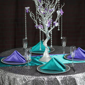
Choose Linen Fabrics That Support the Centerpiece
Color is only part of the equation. The fabric itself affects how that color is seen under lighting and how much attention it draws.
Polyester tablecloths are a common choice because of their matte finish, which provides a clean, non-distracting base. Satin linens, on the other hand, reflect light and can sometimes compete with detailed floral arrangements, especially in brightly lit spaces. Velvet adds depth and richness, making it a good option for deeper tones like emerald or burgundy, particularly in formal or evening settings.
Spandex linens are often used for cocktail tables or corporate events where a sleek, modern look is needed. In these setups, simpler centerpieces benefit from the streamlined appearance of the fabric.
Consider the Event Setting and Lighting
Lighting can completely change how linen colors and florals appear together. A setup that looks balanced indoors may feel washed out or too harsh outdoors.
In natural daylight, lighter linens like ivory or blush can appear brighter than expected, sometimes reducing contrast with soft-colored flowers. Indoors, warm lighting enhances tones like champagne, gold, and peach, making them feel richer and more inviting. For evening events, darker linens tend to perform better because they create stronger contrast under dim lighting conditions.
Use Runners and Overlays to Frame the Centerpiece

When the base linen is already set, table runners and overlays offer a simple way to adjust the overall look without starting from scratch. They can introduce contrast or reinforce your color palette, especially when the linen alone doesn’t fully support the floral arrangement.
A neutral tablecloth paired with a colored runner can help tie in floral tones without overwhelming the table. For example, an ivory base with a dusty blue runner can support blue-accented centerpieces while still keeping the look balanced. Sheer overlays can soften darker linens, while heavily textured or sequined layers should be used carefully since they can compete with detailed florals.
What to Avoid When Pairing Linens and Florals
A few common mistakes can make even a well-planned table fall short.
Matching too closely. When your linen and florals are nearly the same color, the centerpiece gets lost. There is not enough contrast for the eye to separate the two. This is one of the most common mistakes in event styling.
Going too busy with the linen. A heavily patterned or textured linen can compete with the florals instead of supporting them. If your centerpiece is the star, keep the linen simple.
Ignoring the rest of the table. Your linen color does not just interact with the florals. It also has to work with your charger plates, napkins, and other table elements. Look at the full picture before committing to a color.
What to Keep in Mind
Linen colors should always support the floral centerpiece, not compete with it. Even the most expensive arrangements can lose their impact if the tablecloth doesn’t provide the right level of contrast or coordination. The goal is to create a setup where the flowers naturally draw attention without needing extra effort.
At the same time, decisions should never be made in isolation. Linen color, floral design, lighting, and venue all work together. Looking at the full setup rather than focusing on one element at a time leads to better, more consistent results across every table.
Frequently Asked Questions
How do you choose linen colors that make floral centerpieces stand out?
Start with the floral palette and identify the dominant colors. From there, choose linens that either contrast or slightly offset those tones to keep the arrangement visually separate from the table.
What linen colors work best for bold floral centerpieces?
Neutral tones like ivory, champagne, taupe, and light gray work well because they don’t compete with strong colors. They allow bold arrangements to remain the focal point.
Should linen colors match floral centerpieces exactly?
Exact matching often causes the centerpiece to blend into the table. It’s better to use a lighter or darker variation or a neutral base to create contrast.
How do fabric types affect how centerpieces look on the table?
Matte fabrics like polyester provide a clean background that keeps attention on the flowers. Shiny materials like satin reflect light and can draw focus away if not used carefully.
What is the safest linen color if the flowers are not finalized?
Neutral shades such as ivory, champagne, and soft gray are the safest options. They work with most floral palettes and give you flexibility as details are finalized.
Can bold linens still work with floral centerpieces?
Yes, but they need to be paired carefully. Bold linens work best when the florals are lighter or more restrained, so the table doesn’t feel too heavy or visually crowded.