Summary
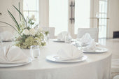
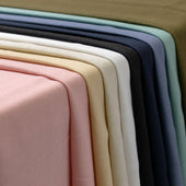
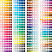
Napkins might be a small detail, but they play a major role in completing your tablescape and reinforcing your event design. Choosing the right colors helps create balance, enhance your overall décor, and highlight key elements of your theme. You can explore a wide range of shades and fabrics in the napkins collection to find the perfect match for your celebration.
Our Products


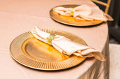
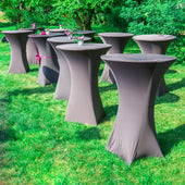
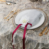
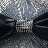
Napkin Rings
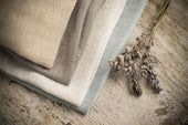
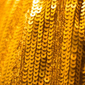
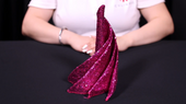
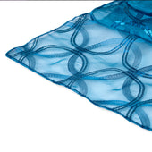
Linen Napkins
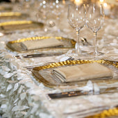
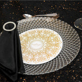
Charger Plates
Why Napkin Color Matters
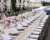
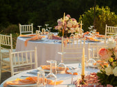
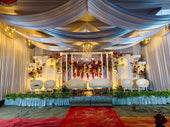
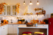
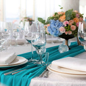
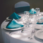
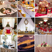
Napkin color influences the tone and mood of your table design. Whether you are hosting a wedding, corporate event, or birthday party, your napkins help pull together the colors used across your linens, centerpieces, and décor elements. They sit close to your place settings, so the color you choose has a noticeable effect on the presentation.
Matching napkin colors with your theme also helps make your photos more cohesive. When the palette flows from tablecloth to napkin to centerpiece, your tables look complete and well-coordinated.


Start With Your Main Color Palette
Most events begin with a chosen color palette. It can come from a wedding theme, seasonal inspiration, branding, or personal preference. Once your palette is set, you can identify which color the napkins should carry. Napkins can match the main color, highlight a secondary color, or serve as a subtle accent.
If your palette consists of soft neutrals, using napkins as a pop of color can make the table feel more lively. For bold or rich themes, neutral napkins help balance the overall look.
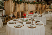
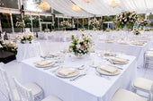
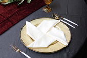
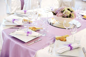
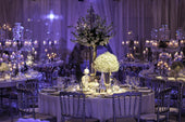
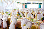
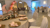
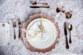
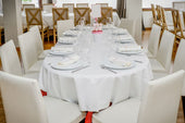
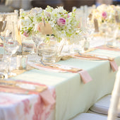
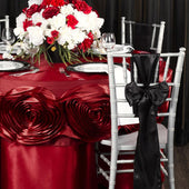
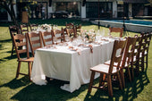
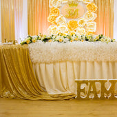
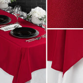
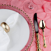
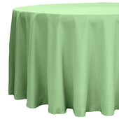
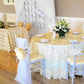
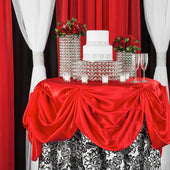
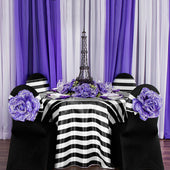
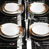
Matching Napkins to Tablecloths
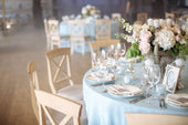
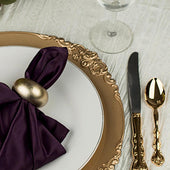
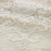
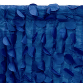
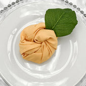
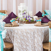
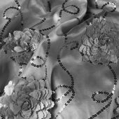
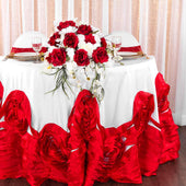
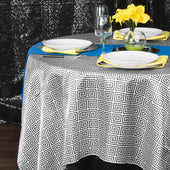
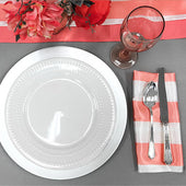
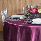
Napkins often look best when they coordinate with the tablecloth. You can choose matching colors for a seamless design or pair them with contrasting tones for visual variety. If you are using statement fabrics such as velvet tablecloths, napkins in lighter or neutral tones help maintain balance.
Layering works particularly well with detailed fabrics. When working with textured or printed linens, choose napkins that complement rather than compete with the tablecloth. This keeps the focus on your table’s main features without overwhelming the design.
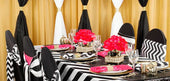
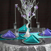
Complementary and Tonal Color Matching
There are three easy approaches to color matching:
Complementary Colors
These are colors opposite each other on the color wheel, such as blue and orange or red and green. Complementary pairs add contrast while keeping the look unified.
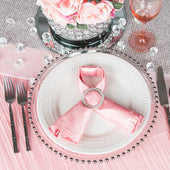
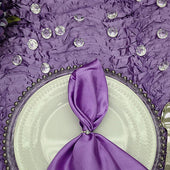
Tonal Colors
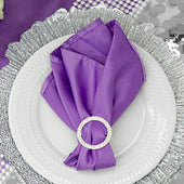
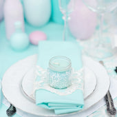
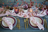
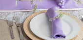
These colors come from the same family but vary slightly in shade or intensity. For example, pairing light blush linens with dusty rose napkins creates a soft, cohesive palette.
Analogous Colors
These are colors next to each other on the color wheel, like pink with lavender or sage with olive. This approach creates harmony across your table design.
These three methods help you match napkin colors with your theme without worrying about clashing tones.
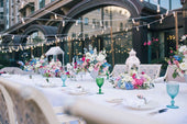
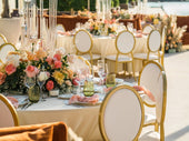
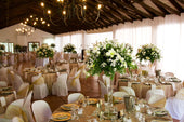
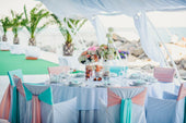
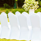
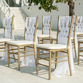
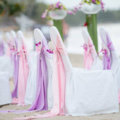
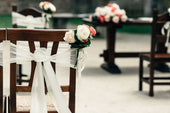
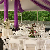
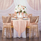
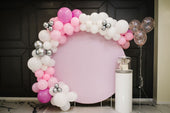
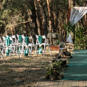
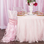
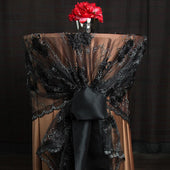
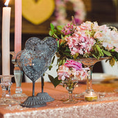
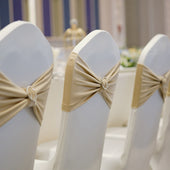
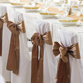
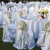
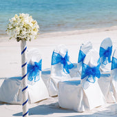
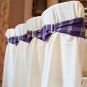
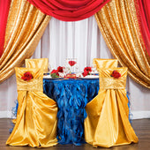
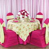
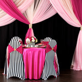
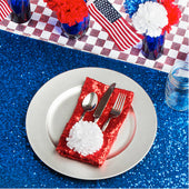
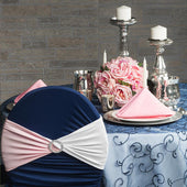
Coordinating Napkins with Chairs and Accents
Napkins do not have to match only your table linens. They can also tie in details from your chairs or tabletop décor. Using accessories like chair sashes allows you to extend your color palette across the room.
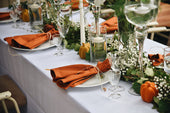
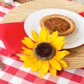
Napkins can highlight accent colors found in your centerpieces, menus, or table signage. If your theme includes greenery or florals, choosing napkins that complement those tones can make your tablescape more unified.
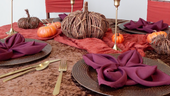
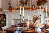
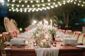
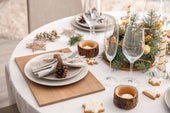
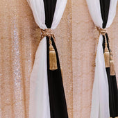
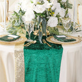
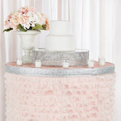
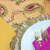
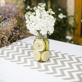
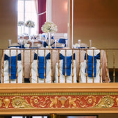
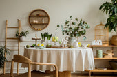
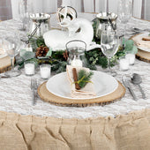
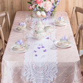
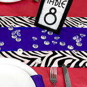
Working with Runners and Layered Linens
When you use table runners, napkin colors help bring depth to the layout. Napkins can either match the runner or balance it with a coordinating shade. Layering your linens creates opportunities to add color in subtle ways, especially if your base cloth is neutral.
Runners with texture or pattern benefit from napkins in solid, softer tones. If your runner is understated, napkins can carry a richer or more dramatic color to elevate the overall setting.
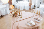
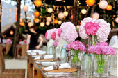
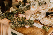
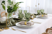
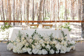
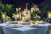
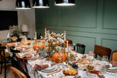
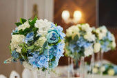
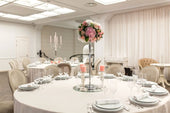
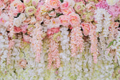
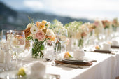
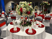
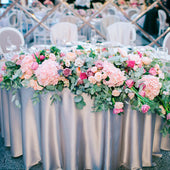
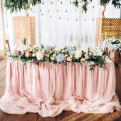
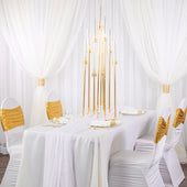
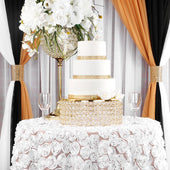
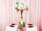
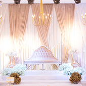
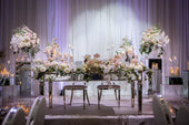
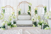
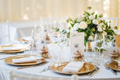
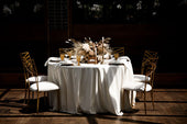
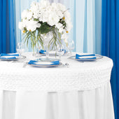
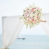
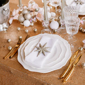
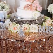
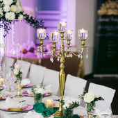
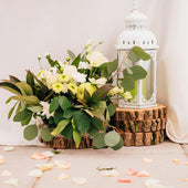
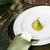
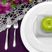
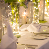
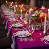
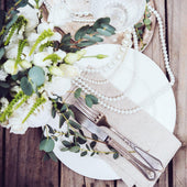
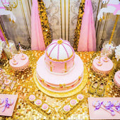
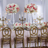
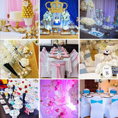
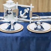
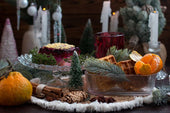
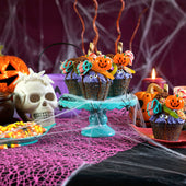
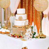
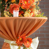
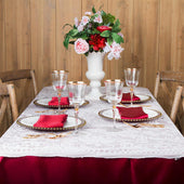
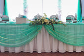
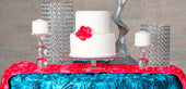
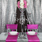
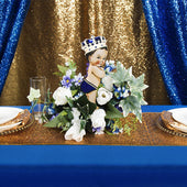
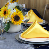
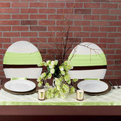
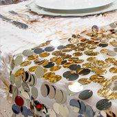
Matching Napkins to Centerpieces
Centerpieces play a major role in your event’s visual theme. Napkins can help highlight floral arrangements, candles, or décor accents by matching or complementing their colors. Using elements such as centerpieces as a reference point can help guide your napkin color selection.
If your centerpieces feature bold blooms or metallic details, choose napkins that support those colors without overpowering them. Muted or textured napkins often work well alongside statement pieces.
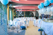
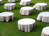
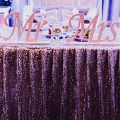
Coordinating Colors Across the Room
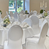
Your napkin color should not only match your table but also the entire event layout. If you are working with different table shapes or sizes, using the same napkin color helps maintain consistency. Adding elements like chair covers also helps extend your palette from the tables to the seating area, maintaining a unified look.
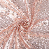
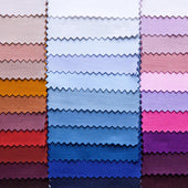
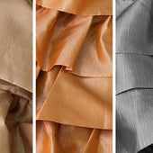
Tips for Choosing the Right Napkin Material
Different fabrics show color differently. Satin napkins reflect light and create shine, while polyester napkins offer a matte finish for a softer look. Consider your event’s tone and lighting when choosing the material. Evening events may benefit from richer textures, while daytime celebrations work well with matte finishes.
Frequently Asked Questions
Should napkins match the tablecloth or the theme color?
Napkins can match either. For a seamless look, match the tablecloth. For more visual interest, match a secondary color or accent shade from your theme. Both approaches create a coordinated design.
What napkin colors work best for weddings?
Soft neutrals like ivory, taupe, blush, or sage are popular for weddings. These shades complement most floral arrangements and table settings. Bold tones work well for themed weddings or evening celebrations.
How do I choose napkin colors for a mixed table layout?
Choose one consistent napkin color to unify the room. Mixed table shapes and styles look cohesive when the napkins match. The consistency helps balance visual variation across the space.