Summary
Red and green are the default Christmas palette, but they are far from the only option. Alternative Christmas color combinations, from forest green and chocolate brown to icy blue and silver, can produce tablescapes that feel more sophisticated, more personal, and more visually distinctive than the standard holiday setup. The key is committing to the palette across every linen and tabletop element so the combination reads as intentional rather than accidental. This guide covers seven unexpected Christmas color schemes and how to use velvet tablecloths, runners, overlays, and accents from CV Linens™ to bring each one to life.
Our Products


Christmas
Weddings
Centerpieces
Quick Answer
- Alternative Christmas palettes work best when built around one dominant color, one neutral, and one metallic accent, following the same three-part structure as any event palette.
- Forest green and chocolate brown are the strongest non-traditional Christmas combinations for a woodland or rustic aesthetic.
- Red velvet with gold is the most elevated version of the traditional palette and reads as formal rather than festive.
- Icy blue and silver create a winter wonderland look that works especially well for evening events.
- Carry the palette consistently across the tablecloth, runner, overlay, charger plates, and napkins for a cohesive result.
- Texture contrast, velvet against sequin, or matte against sheer, adds visual depth without requiring additional colors.
Why Alternative Christmas Color Combinations Work
The traditional red and green palette is immediately recognizable, which is both its strength and its limitation. For event professionals, venue managers, and hosts who want a Christmas setup that reads as styled rather than seasonal, an alternative palette creates visual distinction while still communicating the holiday theme through other elements like candles, organic accents, and centerpiece choices.
Alternative palettes also photograph better in many cases. Deep jewel tones, earthy neutrals, and cool metallics tend to read more richly under warm event lighting than the high-contrast red and green combination, which can flatten in photos when not carefully balanced.
The approach is the same regardless of which alternative palette you choose. Pick a dominant color, add a neutral, introduce a metallic accent, and carry the combination consistently across every surface.
Seven Alternative Christmas Color Combinations
Forest Green and Chocolate Brown


This is the most effective non-traditional Christmas palette for rustic venues, barn settings, and woodland-themed events. Forest green as the dominant color, chocolate brown as the grounding neutral, and gold or copper as the metallic accent.
A forest green tablecloth paired with a chocolate brown table runner creates a warm, earthy base that reads as Christmas-adjacent without relying on red. Add gold charger plates, ivory napkins, and organic accents like pinecones, cinnamon sticks, and miniature pears to complete the woodland aesthetic. The combination works particularly well on wooden farm tables where the brown tones in the linen connect to the natural grain of the table surface.
For a more glamorous version of this palette, a willow green sequin overlay over a chocolate brown tablecloth introduces sparkle while keeping the earthy color story intact. The glitz sequin taffeta table overlays collection includes options that work well for this combination.
Red Velvet and Gold


This is the most elevated version of the traditional Christmas palette. Rather than the flat, high-contrast red and green combination, red velvet and gold read as formal and luxurious, closer to a winter gala aesthetic than a holiday party.
Red velvet tablecloths are the strongest base for this palette. The texture of velvet adds depth and richness that flat polyester cannot replicate, and under warm event lighting, the fabric reads as genuinely luxurious. Pair with a gold runner, gold charger plates, and ivory or white napkins. Keep the accent elements in gold and ivory rather than introducing green, which shifts the palette back toward the traditional Christmas combination.
Candelabra centerpieces in gold or black with ivory taper candles complete the formal look. This palette works best for evening events where the candlelight enhances the depth of the red velvet and the warmth of the gold accents.
Icy Blue and Silver

Icy blue and silver is the strongest winter wonderland palette and works especially well for evening events, corporate holiday parties, and any setup where the goal is elegance rather than warmth. The cool tones create a crisp, sophisticated look that reads as distinctly winter without any of the traditional Christmas color associations.
A pale blue or ice blue tablecloth paired with a silver sequin runner creates a table that catches light dramatically and reads as festive without being seasonal. Silver charger plates, white napkins, and crystal or glass candle holders complete the place setting. Add white florals, frosted branches, or silver ornaments as centerpiece accents to reinforce the winter aesthetic.
This palette photographs exceptionally well under cool or neutral lighting and works particularly well in venues with white or light grey walls that reflect the silver and blue tones.
Burgundy and Blush

Burgundy and blush are a romantic alternative that works well for Christmas events with a softer, more feminine aesthetic. The combination of deep red-purple and soft pink reads as warm and intimate rather than festive, which makes it effective for holiday dinner parties, bridal showers held during the Christmas season, and intimate gatherings.
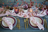
A burgundy tablecloth with a blush or rose gold runner creates a layered palette that reads as intentional and editorial. Add gold charger plates, blush napkins, and taper candles in ivory or blush to complete the place setting. Dried florals in mauve, burgundy, and cream work well as centerpiece accents for this palette.
Emerald Green and White

Emerald green and white is a clean, graphic alternative to the traditional Christmas palette that works well for modern venues, minimalist aesthetics, and events where the goal is a polished, contemporary look rather than a warm, cozy one.
A deep emerald green tablecloth against crisp white napkins and white charger plates creates a high-contrast combination that reads as bold and intentional. Add gold or brass accents in the candle holders and flatware to introduce warmth without shifting the palette toward the traditional red and green combination. White florals, eucalyptus, and simple greenery work well as centerpiece elements for this palette.
Navy and Gold

Navy and gold is one of the most versatile alternative Christmas palettes because it works across a wide range of event types and venue styles. The combination reads as formal and celebratory without any specific seasonal association, which makes it effective for corporate holiday events where a strong Christmas aesthetic may not be appropriate.
A navy tablecloth with a gold runner and gold charger plates creates a place setting that reads as elegant and intentional. Add ivory or white napkins, gold flatware, and simple white florals to complete the look. This palette works well with both warm and cool lighting and photographs cleanly in most venue environments.
Champagne and Ivory

Champagne and ivory are the most understated alternative Christmas palette and work best for formal events where the goal is elegance rather than festivity. The tonal combination of warm neutrals reads as luxurious and refined, and the Christmas theme is communicated through the centerpiece and accent choices rather than the color palette itself.
A champagne or ivory velvet tablecloth paired with a gold or champagne sequin overlay creates a luminous, tonal base that catches light beautifully under warm event lighting. Add gold charger plates, ivory napkins, and tall white floral centerpieces with gold accents to complete the formal look. This palette works particularly well for black-tie holiday events and New Year's Eve celebrations that extend through the Christmas season.
How to Build a Cohesive Alternative Christmas Palette
Regardless of which color combination you choose, the same three-part structure applies.
- Pick a dominant color. This is the boldest tone in the palette and should appear on the tablecloth or as the primary runner color.
- Add a neutral. Ivory, cream, white, or taupe grounds the palette and prevents the dominant color from overwhelming the table.
- Choose a metallic accent. Gold, silver, or copper adds contrast and sparkle at the charger plate, candle holder, and flatware level. Match the metallic temperature to the palette: warm metallics for warm palettes, cooler metallics for blue or green-dominant combinations.
Layer the palette across every surface. The tablecloth, runner, overlay, napkins, and charger plates should all pull from the same two or three colors. Inconsistency across the table is the most common reason an alternative palette reads as unfinished rather than intentional.
Styling Tips for a Cohesive Alternative Christmas Look
- Use organic accents like pinecones, cinnamon sticks, dried botanicals, and seasonal greenery to communicate the Christmas theme without relying on traditional red and green.
- Add lighting through candles, fairy lights, or amber votives. Warm light enhances jewel tones and metallic accents. Cool light works better for icy blue and silver palettes.
- Use wood slabs and slices as natural risers for centerpieces and dessert displays. The organic texture connects to the woodland and harvest aesthetic that works across multiple alternative Christmas palettes.
- Coordinate the palette across invitations, signage, and menu cards so the color story reads consistently from the moment guests arrive.
Final Thoughts
Alternative Christmas color combinations give event professionals and hosts the flexibility to create a holiday setup that feels personal, sophisticated, and visually distinctive. The palette does not need to include red and green to communicate Christmas. The candles, the organic accents, the centerpiece choices, and the overall warmth of the event do that work. CV Linens™ carries the tablecloths, runners, overlays, and charger plates needed to build any of the seven palettes covered in this guide, and the wholesale pricing makes it practical to experiment with a new combination each season.
Frequently Asked Questions
What are the most popular alternative Christmas color combinations?
Forest green and chocolate brown, red velvet and gold, icy blue and silver, and burgundy and blush are the four most popular non-traditional Christmas palettes for event use. Each works across a range of event types and venue styles and can be built using standard linen and tabletop products.
How do I make an alternative Christmas palette still feel like Christmas?
Use organic accents like pinecones, cinnamon sticks, dried botanicals, and seasonal greenery to communicate the Christmas theme through the centerpiece and decor rather than the color palette. Candles and warm lighting also reinforce the holiday atmosphere regardless of the linen color.
Can alternative Christmas palettes work for corporate holiday events?
Yes. Navy and gold, champagne and ivory, and emerald green and white are particularly effective for corporate holiday events because they read as elegant and celebratory without a strong seasonal association. These palettes work well in venues where a traditional Christmas aesthetic may not be appropriate for all guests.
What fabric works best for an alternative Christmas tablescape?
Velvet is the strongest fabric choice for formal alternative Christmas setups because the texture adds depth and richness that reads as luxurious under warm event lighting. Sequin overlays work well as a second layer for palettes that need more sparkle. Standard polyester tablecloths in the chosen palette color are a practical base for more casual or high-volume event setups.
How do I carry an alternative Christmas palette consistently across the full table?
Apply the three-part structure: dominant color on the tablecloth or runner, neutral in the napkins or overlay, and metallic accent in the charger plates and candle holders. Every element on the table should pull from the same two or three colors. Introducing a fourth color, even as a small accent, is the most common reason an alternative palette reads as inconsistent.