Summary
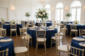
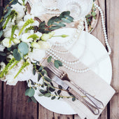
A fully styled tablescape is built in three dimensions, not one. Height creates visual interest from across the room. Texture creates depth that reads clearly in close-up photos. Color carries the palette from the tablecloth to the individual place setting, so the table reads as a single cohesive decision. Most setups get one of these right. The ones that photograph well and generate rebooking get all three. This guide covers how to layer height, texture, and color using velvet tablecloths, overlays, runners, stands, and charger plates from CV Linens™ so every table reads as intentional from every angle.
Our Products


Quick Answer
- Height comes from centerpiece stands, tiered cake stands, and candelabras. Vary the heights across the table rather than using a single tall centerpiece.
- Texture comes from layering fabrics with different finishes; velvet against sheer, matte against sequin, gauze against satin.
- Color is carried from the tablecloth through the overlay, runner, napkins, and charger plates using a two-to-three-color palette.
- Build in this order: tablecloth first, overlay second, runner third, then height elements, then place setting.
Layer One: Height

Height is the first thing guests notice when they enter a room because it reads from a distance before any other detail is visible. A flat table with no vertical elements reads as a buffet. A table with varied heights reads as styled.
The most effective approach to height is variation rather than uniformity. A single tall centerpiece at the center of the table creates one focal point. A combination of a tall centerpiece flanked by shorter candle holders or bud vases at varying heights creates a graduated landscape that reads as more complex and more intentional.
Cake and cupcake stands are the most versatile height tool for dessert tables and styled displays because they come in multiple tiers and sizes and can be used to elevate both food and decorative elements. For reception tables, candelabras and floral risers at varying heights create the same graduated effect. The rule is that no two adjacent elements should be the same height. Variation is what creates visual interest. Uniformity flattens it.
Layer Two: Texture


Texture is what makes a tablescape read as dimensional in photos rather than flat. A table with a single fabric type, even a beautiful one, reads as one-dimensional. A table with two or three contrasting fabric textures reads as layered and complex.
The most effective texture contrast pairs a matte or soft base with a sheer or reflective second layer. A velvet tablecloth as the base, paired with a sheer table overlay on the diagonal, introduces an immediate texture contrast that reads clearly in photos. The velvet absorbs light. The sheer reflects it. That difference in light behavior is what creates the dimensional quality that makes the table look styled rather than simply covered.
A cheesecloth table runner on top of a solid base tablecloth introduces a third texture, organic and loosely woven, that contrasts with both the velvet and the sheer. Three fabric textures on the same table, including matte, sheer, and gauze finishes, create a layered result that reads as intentional and editorial without requiring any additional decorative elements.
The principle is contrast, not matching. Fabrics that are too similar in texture read as redundant rather than layered. Choose textures that behave differently under light and the layering will be visible in every photo.
Layer Three: Color


Color is the element that ties height and texture together into a single cohesive tablescape. Without a consistent color story, a table with great height variation and interesting texture contrast still reads as assembled from separate decisions rather than designed as a whole.
The two-to-three-color structure applies here. One dominant color in the tablecloth, one neutral in the overlay or napkins, one metallic accent in the charger plates and flatware. Every element on the table should pull from one of those three colors.
Satin napkins in the dominant palette color placed at each seat carry the color from the center of the table to the individual place setting. This is the detail that makes the table read as fully designed rather than partially styled. When the napkin color matches the tablecloth or runner, the palette reads as intentional at every scale, from across the room and up close.
Charger plates in a consistent metallic finish, gold for warm palettes, silver for cool ones, complete the color story at the seat level. Keep the finish identical across every seat. Variation in charger finish reads as inconsistency rather than intentional contrast.
Build in the Right Order
The sequence matters as much as the elements. Build the table in this order: base tablecloth first, overlay second, runner third. Then add the height elements, centerpiece, candle holders, and risers. Then set the place setting, charger plate, napkin, and flatware last.
Building in this order ensures that each layer is visible before the next one is added, which makes it easier to assess whether the texture contrast and color balance are working before the table is fully set. Adjustments are much easier to make at the tablecloth and overlay stage than after the place settings are in place.
Final Thoughts
Height, texture, and color are the three dimensions of a fully styled tablescape. Each one works independently, but all three together are what produce the setups that photograph well, generate client referrals, and build a recognizable portfolio. CV Linens™ carries the velvet tablecloths, overlays, cheesecloth runners, cake stands, satin napkins, and charger plates needed to build all three layers across any event setup.
Frequently Asked Questions
What is the correct order to build a tablescape?
Start with the base tablecloth, then add the overlay, then the runner. Once the linen layers are set, add the height elements, centerpiece, candle holders, and risers. Set the place setting last, charger plate, napkin, and flatware. Building in this order lets you assess each layer before adding the next.
How many fabric textures should a tablescape have?
Two to three textures is the most effective range. A matte or soft base, a sheer or reflective second layer, and an organic or loosely woven runner create enough contrast to read as dimensional in photos without becoming visually overwhelming. More than three textures on the same table tend to read as busy rather than layered.
How do I create height variation on a reception table?
Use a combination of a tall centerpiece flanked by shorter candle holders or bud vases at varying heights. No two adjacent height elements should be the same height. Variation is what creates visual interest. A single tall centerpiece with nothing around it reads as isolated rather than styled.
How do I carry color consistently across the full table?
Apply the two-to-three-color structure: one dominant color in the tablecloth or runner, one neutral in the overlay or napkins, one metallic accent in the charger plates. Every element on the table should pull from one of those three colors. When the napkin color matches the tablecloth or runner, the palette reads as intentional at every scale.
Does texture contrast matter more for photos or in person?
Both, but it is especially important for photos. Fabrics that behave differently under light, one absorbing it and one reflecting it, create a dimensional quality that reads clearly in photos. A table with a single fabric type can look beautiful in person but flat in photos. Texture contrast is what makes the difference between a setup that looks good and one that photographs well.