Summary
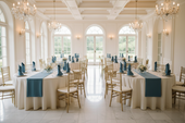
A cohesive color story is not about using the same color on every surface. It is about using the same two or three colors consistently across every element of the room, from the backdrop draping to the tablecloth to the chair sash to the napkin. So the space reads as a single designed environment rather than a collection of separately styled zones. Most receptions get the table right and leave the chairs, the backdrop, and the vertical space as afterthoughts.
This guide covers how to build a color story that runs through every layer of the room using table runners, chair sashes, draping, and coordinated tabletop elements from CV Linens™.
Our Products


Quick Answer
- A cohesive color story uses two to three colors applied consistently across every element of the room, not just the table.
- The three-part palette structure is one dominant color, one neutral, and one metallic accent.
- Carry the dominant color from the tablecloth to the chair sash to the backdrop draping so it reads at every scale, close up and from across the room.
- The neutral, typically ivory or white, appears in the overlay, the napkins, or the chair cover and prevents the dominant color from overwhelming the space.
- The metallic accent appears in the charger plates, flatware, and candle holders and ties the tabletop to the room-level palette.
Start With the Three-Part Palette Structure

Every cohesive reception color story is built on the same three-part structure regardless of the specific colors involved: one dominant color, one neutral, and one metallic accent.
Highest-surface-area elements" sounds technical and slightly unnatural. When the dominant color appears on both the table and the chairs simultaneously, it reads at room scale rather than just at table scale, which is what makes the space feel designed rather than decorated.
The neutral, typically ivory, cream, or white, grounds the palette and prevents the dominant color from overwhelming the room. It appears in the overlay, the napkins, or the chair cover underneath the sash. Its job is to give the eye a place to rest between the dominant color elements.
The metallic accent, gold or silver, appears in the charger plates, flatware, and candle holders. It introduces light reflection at the tabletop level and ties the individual place setting back to the room-level palette. Choose the metallic temperature based on the dominant color: warm metallics for warm palettes, cool metallics for cool or jewel-tone palettes.
Carry the Color From the Room to the Table
The most common color story failure in reception design is a beautifully styled table inside a room where the vertical space, the chairs, the backdrop, and the draping have not been addressed. The table reads as an island rather than as part of a designed environment.
To avoid this, apply the dominant color at three scales: room scale, table scale, and seat scale.
Room scale is the backdrop and the draping. Sheer voile curtain drape panels in the dominant palette color or in ivory hung behind the head table or along the perimeter of the venue introduce the color at the largest scale and give the room a finished, event-quality look before any guest reaches the table.
Table scale is the tablecloth and the runner. A premium polyester, satin, velvet, or sequin tablecloth in the dominant color establishes the palette at the table level. The runner in the accent or neutral color defines the center line and introduces the second color of the palette.
The seat scale is the chair sash and the napkin. Satin Chair Sashes create a classic look, while chiffon or velvet chair sashes can introduce additional texture without changing the overall palette.
When the same two or three colors appear at all three scales, the room reads as a single cohesive environment. When any one scale is missing, the color story feels incomplete.
Apply the Palette at the Place Setting
The place setting is where the color story makes its most personal impression because it is the element each guest interacts with directly. A place setting that pulls from the same palette as the room-level draping and the table-level tablecloth communicates that the design was intentional at every scale.
Gold charger plates under white or ivory dinner plates reinforce the metallic accent at the seat level and connect the individual place setting back to the gold accents in the candle holders and flatware. Keep the charger finish identical across every seat. Variation in charger finish reads as inconsistency rather than intentional contrast.
Premium polyester napkins hold crisp folds well, making them ideal for maintaining a polished place setting throughout the event.
Avoid the Most Common Color Story Mistakes


Using too many colors
More than three colors across the room, table, and seat elements produce a setup that reads as assembled rather than designed. Every additional color reduces the visual impact of the ones before it.
Inconsistent metallic finish
Mixing gold and silver across the same table, gold charger plates with silver flatware, reads as an oversight rather than a design choice. Choose one metallic temperature and apply it consistently across every reflective element.
Ignoring the vertical space
A beautifully styled table inside an unstyled room reads as incomplete. The backdrop, the draping, and the chair treatments are what make the table read as part of a designed environment rather than a standalone display.
Matching instead of coordinating
The dominant color does not need to be identical across every element. A burgundy tablecloth with a blush chair sash and a dusty rose napkin reads as a cohesive palette because all three colors pull from the same color family. Exact matching across every element reads as rigid rather than designed.
Final Thoughts
A cohesive reception color story is built through consistent application of two to three colors across every scale of the room, from the backdrop draping to the tablecloth to the chair sash to the napkin. CV Linens™ carries the sheer draping, sequin tablecloths, satin chair sashes, gold charger plates, and polyester napkins needed to build that consistency across every element of the reception space
Frequently Asked Questions
How many colors should a reception palette have?
Two to three. One dominant color, one neutral, and one metallic accent. Using more than three colors across the room, table, and seat elements produces a setup that reads as assembled rather than designed. The specific colors can vary widely, but the three-part structure should stay consistent.
How do I carry the color from the table to the rest of the room?
Apply the dominant color at three scales: room scale in the backdrop draping, table scale in the tablecloth and runner, and seat scale in the chair sash and napkin. When the same color appears at all three scales, the room reads as a single cohesive environment.
Should the chair sash match the tablecloth exactly?
Not necessarily. The chair sash should pull from the same color family as the tablecloth, but an exact match is not required. A burgundy tablecloth with a blush or mauve chair sash reads as a cohesive palette because both colors belong to the same family. Exact matching across every element can read as rigid rather than designed.
What is the difference between matching and coordinating colors?
Matching means using the exact same color across multiple elements. Coordinating means using colors from the same family that work together without being identical. Coordinating produces a more natural, designed result. Matching can read as overly uniform, particularly when the same color appears on both the tablecloth and the chair sash at the same saturation level.
Why does the metallic finish need to be consistent?
Mixing gold and silver across the same table reads as an oversight rather than a design choice. The metallic finish is a small detail, but it appears on multiple elements simultaneously, including charger plates, flatware, and candle holders. It is also one of the first inconsistencies guests notice at close range. Choosing one metallic temperature and applying it consistently is one of the simplest ways to make a place setting read as fully designed.